The "tree map" below shows the relative size (dollars) of Information Technology (IT) investments in the various Federal agencies. The Defense Department is the largest chunk and the tiny bit in the bottom right corner is the Smithsonian. This is one of the many displays available to the public on the Federal IT Dashboard.
The idea behind the IT Dashboard is great: Require all major IT investment programs to post and update information about their state and status on a publicly available website. The information would be available to be scrutinized by interested press, public, auditors, contractors, and those INSIDE the federal government.
So, how’s the Federal IT Dashboard working out?
Two Points.
POINT ONE: the website is a well designed, organized, professional, interactive, and had appealing…. I’d even say ‘gorgeous’ ways of presenting extremely complex,
voluminous data. There are pull down
lists for filtering data and for selecting the method of display (tables, graphs, even animated timelines), and there are great visualizations that you can design for yourself
that shows the trends in spending, progress and other factors over the last 10+
years.
To understand how (our) ~$76,000,000,000 is being spent on almost
7,400 IT projects, you can and should visit and explore for yourself: https://itdashboard.gov. You will find information on individual
programs and projects as well. I find
that part the most interesting, especially for projects that I was involved in, or read about in the press. That’s where “POINT TWO” comes in.
POINT TWO: Bureaucracies and the people in them tend NOT to
deliver bad news up the chain. Whether
it’s wishful thinking that things will improve, or thinking that nobody is
watching, or simply fear of negative consequences is immaterial. The effect is that rather than having actual
insight into a program, those who depend on such data actually have flawed insight. Well, maybe they have great
insight into programs that have no troubles, and little insight into those that NEED intervention from higher up in the chain.
The data that feeds the IT dashboard is supposed to be reviewed
and ‘blessed’ by Chief Information Officers in the reporting agencies, but
there also is perhaps a tendency for the CIOs to avoid ‘help’ from up the
chain. If the IT Dashboard had the
Healthcare.gov project identified as behind schedule, who cared? If it didn’t
identify issues…. What happened?
One way to avoid getting ‘help’ is to modify a program’s basic
elements of reporting (cost, schedule, functionality). All or most reporting systems properly allow
changes to these ‘baseline’ factors. The
issue is who keeps up with the rolling and cumulative changes over time? Too often, a change is the baseline basically
becomes a new start for reporting purposes. OR… is so confusing in the end, that it becomes almost impossible to figure out what capability the project will deliver…. at what cost….at what date.
In the project shown below, the baseline has been changed 5
times since 2009 (each Δ
is a baseline change). I found this one by
searching for a project that was “ALL GREEN”.
But when I looked into the details and the "Evaluation Explanation", I found that they
acknowledge having program management problems and their cost profile is RED
(on the green, yellow, red scale). In this case I also notice that an adjustment of the baseline was followed by a DECREASE in score rather than what I would expect to be an INCREASE in score (a baseline lets a project reset it's goals, cost estimates, and schedule).
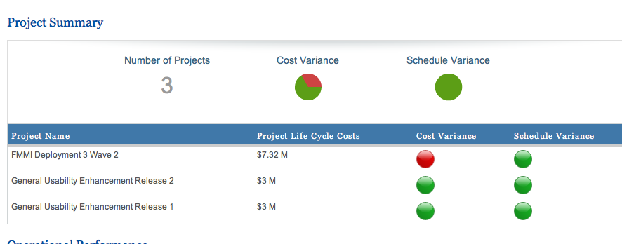
In another graphic, same program, it appears to me that the part of the project that is active is
actually RED, but the future parts of the project that are not yet active are
GREEN. I guess the FIVE GREEN
cost/schedule scores overwhelm the ONE RED cost score? Even if the RED one is the same cost as the GREEN ones combined? Jumpin' Jimminy.
From personal experience I can tell you that there are many dedicated people feeding the many data sources that drive the IT Dashboard. But as that data gets interpreted or adjusted or scored/colorized as it works it's way up the chain leaves lots of room for creeping, serial … . ummm…errrr…ummm.... overly optimistic reinterpretation of the data by the management chain during the data aggregation phase of reporting.
Fortunately there is a lot of semi-raw data on the website for one to explore. Unfortunately the eye candy charts and graphs don't always reflect the data and may distract and mislead observers who do not dig deeper into the details. This effort is 5 years old, and I guess is still a crawling or walking toddler. I hope it matures and begins running soon.
Fortunately there is a lot of semi-raw data on the website for one to explore. Unfortunately the eye candy charts and graphs don't always reflect the data and may distract and mislead observers who do not dig deeper into the details. This effort is 5 years old, and I guess is still a crawling or walking toddler. I hope it matures and begins running soon.


No comments:
Post a Comment